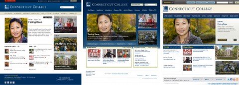
Photos from College Website
Although almost all students would agree that there are things that should be changed at Connecticut College, very few would think of our internet homepage as one of them. Our homepage is simple, easy to use, aesthetically pleasing and is one of the few things on campus that has never seemed to come under the criticism of students. However, by the end of 2010, our homepage will change.
Jill Grossman, the Director of Online Communications, explained that change to the new homepage is “a facelift, not a redesign of the entire site.”
“There isn’t anything wrong with the site, but we are trying to make it better and more flexible to reflect the new identity of Conn,” said Grossman. She also explained that the changes are taking place “to keep up with web technologies and other colleges.”
Our current website was designed three and a half years ago, which is considered a long time in the Internet world. Even though most students might not find the website outdated, it has some features that are no longer typical or in style.
Grossman described other goals for the site, including more graphics, more accessible information and the ability to easily change or update the site’s information. According to Grossman, the current website is very static; the news section is the only one ever really updated. She hopes that the new homepage, “will be dynamic, lively and have a flexibility that the current page doesn’t have.”
There are three options for the new look, all of which contain new, easy-to-change modules that will give the site more flexibility. This way, events like Fall Weekend, Commencement or those featuring visiting speakers can be displayed in a more timely and graphic way.
One of the challenges in designing the homepage was adapting to the different audiences that use the website, such as current students, parents, alumni, faculty, staff and prospective students. Appealing to prospective students is one of the major concerns of College Relations, thus, the admissions page will undergo significant changes. These changes will help prospective students access information in an easier and visually appealing way.
College Relations surveyed several groups of prospective high school students from the waiting room in the Admissions Office and local areas, including the Williams School. They found that high school students responded best to graphics and changing content. Though the current admissions site is easy to use, it has very few graphics, is dominated by words and contains predominantly static content. Grossman explained that prospective students feel little incentive to visit the site when the material rarely changes, but would be more likely to come back if there were fresh content.
One of the main concerns while designing the homepage is that it also does not contain photos that would easily link to more information in the site. Grossman explained that there are, “thirty to fifty offices and departments that regularly update their content on the website, and we want to show that on the homepage.” Currently, visitors can only access this information by clicking though links or searching the site.
In order to receive feedback on the three different sites, College Relations decided to send a survey to students, parents, alumni, faculty, staff and parents of students. The survey consisted of three options, and students were instructed to describe their impression of the site, name specifically what they liked least and most about the site, rank the site on a scale of one to five, and finally, pick five adjectives to describe the website. 917 people, 417 of whom were current Conn students, took the survey.
Although College Relations is still sorting through all of the feedback, Grossman said that all options scored well for being, easy to use and organized. She added, “It is really important that people can easily find what they’re looking for.” •


