Photo courtesy of Hannah Plishtin.
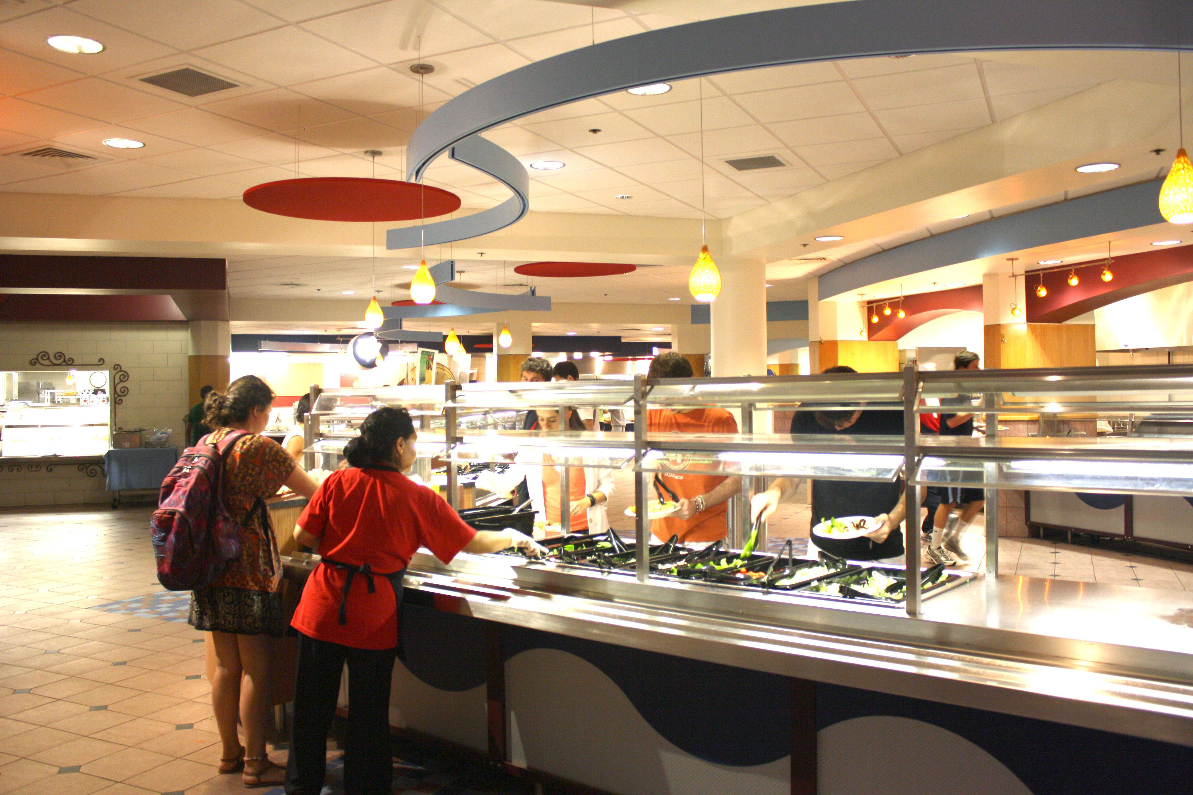
My largest and least practical complaint about the Harris renovations, aside from the continually upsetting idea of swiping in on the right side instead of the left, is in regard to the large red dots that greet you upon entrance into the foyer of the dining hall. When I laid eyes on them for the first time, hanging from the ceiling like some sort of misplaced, circular stop signs, the primary thought that forced itself into my mind was “Oh Look! My period!” My head was flooded with images of Kotex commercials where everything is in black and white and then a big red dot disguised as the center of a flower comes bounding along riddling off facts about superior tampon products and use words like “flow” and “absorbency”. Needless to say, this is not what I want to be reminded of every time I go to eat something.
However, once inside Harris, I do appreciate the subtle, sophisticated ambiance that the new lights provide, the soft glow much more alluring than their florescent predecessors. Even the thin strips of wavy looking metal that run above the salad bar are rather pleasant to look at and bring an open movement to the space that was never their before. But still, I can’t help but look up at the little two-inch lampshades scattered between the different food stations and think, “Really? You cost $250,000?” I just can’t possibly see how rearranging the salad bar, adding some light fixtures and suspending giant red dots could have cost anywhere near $250,000.
Money and aesthetics aside, the new set-up of Harris is simply illogical, the best example being the new placement of the silverware. Before the renovations, when the silverware was on rolling cart-like structures, there were barely ever times when silverware ran out. It only took until my first dinner at Harris this year before all the forks were gone and large metal trays of silverware had to be used to meet the demand. If you’re going to drill into a countertop and make places for silverware, why not drill enough holes? The other end of the counter isn’t even used for anything, so what is the problem?
Additionally, the new placement of the panini presses and toasters next to the cereal is a traffic-inducing nightmare from 8 AM to 11 AM. Everyone is swarming the area attempting to scoop cereal simultaneously from two rows of bins, send bread through the toaster the typical two times (because inevitably someone who only likes their bread warm has set the machine to a warp speed setting) and those who are early to lunch are desperately trying to fight the crowd and avoid burning their arms on various metal contraptions as they struggle to reach the panini press awkwardly out of reach in the corner. Clearly, someone did not think this through.
Despite my complaining, there are actually upsides to the new system. The line for the hot food now has much more room to expand rather then backing up in to the entryway and the pizza looks especially gorgeous on the new countertops. I’ve also come to realize that coffee produced in mass quantities will inevitably never be as good as Starbucks or a homebrewed pot, but the new flavor shots are truly a gift from the dining hall gods. I can only hope that Harris will continue to restructure and improve the look and functionality of the dining hall, but please, I’m begging you, just get rid of the dots. •


